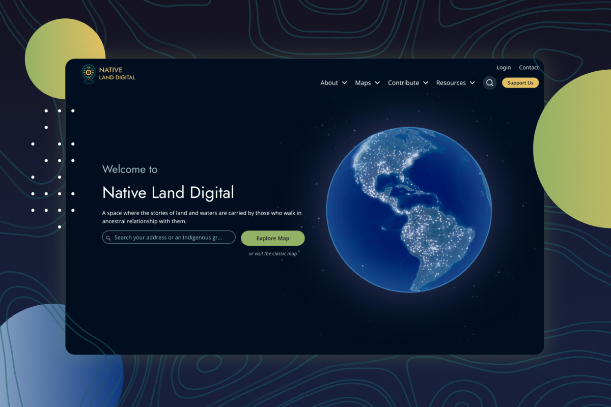
What is a story map?
A story map is a web page that combines an interactive map with narrative text, photos, videos, and data, all in one scrollable experience. You scroll through a story, the map updates as you go, and the geography becomes part of how the story is told.
That's the short answer. The longer answer is that story map usually refers to a specific format popularised by Esri's ArcGIS StoryMaps platform, but the idea works in any mapping tool. We've built them in ArcGIS, Mapbox, and pure Leaflet for clients across Canada.
If you want to see one before reading further, the New York Times Snow Fall piece from 2012 is the project that put this format on the map (literally). Esri's own StoryMaps gallery shows hundreds of working examples ranging from conservation reports to municipal planning documents.
When a story map is the right tool
Story maps work well when the geography is the story. If you can show your work on a map and have it actually mean something, a story map will outperform a regular article or PDF. Some real situations where they fit:
- A conservation organisation showing where it's protected land over a 20-year period, with photos and species data tied to each parcel
- A municipality walking residents through a new zoning proposal, with affected neighbourhoods highlighted as you scroll
- An Indigenous community documenting traditional territory, treaty boundaries, and place names in a way that elders and youth can both navigate
- A research non-profit publishing an annual impact report where the work itself is geographically distributed
- A trail association introducing a new network of routes with photos, difficulty ratings, and trailhead access info
The common thread is that the reader needs to understand both what happened and where it happened, and the where part is doing real work.
When a story map is the wrong tool
A story map isn't a replacement for a regular web page or report. We've talked clients out of building them when:
- The story doesn't actually involve geography in a meaningful way (one map at the top of a regular article is fine; a story map is overkill)
- The audience is decision-makers who need to scan and act, not scroll and absorb (an interactive dashboard is better)
- The data is changing daily (story maps are best for narratives, not live monitoring)
- The budget is under $5,000 (you can build something simpler that gets the job done)
A common mistake is treating story maps as a status symbol. They look impressive in board meetings. But if a regular page would tell the story just as well, save the money.
The main types
Most story maps fall into one of four formats, and the format you pick changes how it gets built.
Scrollytelling
The classic format. The map sits in place while you scroll, and as you pass each section the map zooms, pans, or highlights a new area. Best for guiding people through a sequence of locations or showing change over time.
Sidecar
The map is on one side of the screen, the text on the other. You scroll the text, the map updates. Less dramatic than scrollytelling but easier to scan, and easier to read on phones.
Tour
A pre-defined list of stops. You can click next to move between them, or click directly on a stop on the map. Best for things like walking tours, trail networks, or here are our 20 projects.
Hybrid
A long page that combines all of the above plus regular article content. Most of the story maps we build for non-profits end up in this category because real reports don't fit neatly into one format.
How they are built
Path one: Esri ArcGIS StoryMaps. Esri's hosted platform. If your organisation already has an ArcGIS Online subscription (a lot of municipalities, government agencies, and conservation organisations do), this is the lowest-friction option. You can build a working story map in a few hours using their templates. The trade-off: you're inside Esri's ecosystem, with their styling, their hosting, and their pricing.
Path two: custom build. We build these for clients on Mapbox, Leaflet, or sometimes a combination. The trade-off is reversed: more upfront design and development work, but the result lives on your own website, looks exactly how you want, and has no ongoing Esri subscription cost. We usually recommend this when the story map is meant to be a flagship piece of the organisation's web presence.
If you're a Canadian non-profit deciding between the two, the question is usually: do you already have ArcGIS, and are you OK with the result looking like an Esri story map? If yes, use the Esri platform. If no, build it custom.
What a story map actually costs
Range we've seen for Canadian non-profit and government clients:
- DIY in ArcGIS StoryMaps with internal staff doing the work: included in your existing Esri subscription, plus internal time
- Esri StoryMaps with agency help on design and content: $3,000 to $10,000 CAD
- Custom build on Mapbox or Leaflet: $12,000 to $40,000 CAD depending on data complexity, interactivity, and how much custom design is involved
- Flagship custom build with original photography, animations, and complex data: $40,000 and up
Most of the projects we build for non-profits land in the $15,000 to $25,000 range. That's enough to do something that actually feels worth the scroll, without overspending.
How long they take to build
Two weeks at the absolute minimum if you have all the content ready, a clear design direction, and you're using a platform template. Six to twelve weeks for a real custom build with content production, design rounds, and proper testing. Anyone telling you they can deliver a meaningful story map in a few days is either lying or building something you won't be proud of in six months.
What good story maps have in common
After building these for a while, the patterns are clear:
- A reason to scroll. Each section earns the next one. If your reader could skim three paragraphs and get the point, you don't need a story map.
- One main thread. Trying to tell three stories at once produces a story map that doesn't tell any of them well.
- Photos that aren't stock. Real images from the work being described. This matters more than design polish.
- A clear ending. The reader should know what to do next. Donate, sign up, attend, share, or just understand. Without an ending, the story map dribbles into nothing.
- Mobile that actually works. Half your readers will be on a phone. If the map is unusable there, you've built a desktop demo, not a publication.
Pragmatica builds story maps and custom web mapping projects for Canadian non-profits, conservation organisations, and government agencies. See our GIS and mapping services or get in touch to discuss your project.